User Interface (UI) Design
Simplicity and Clarity:
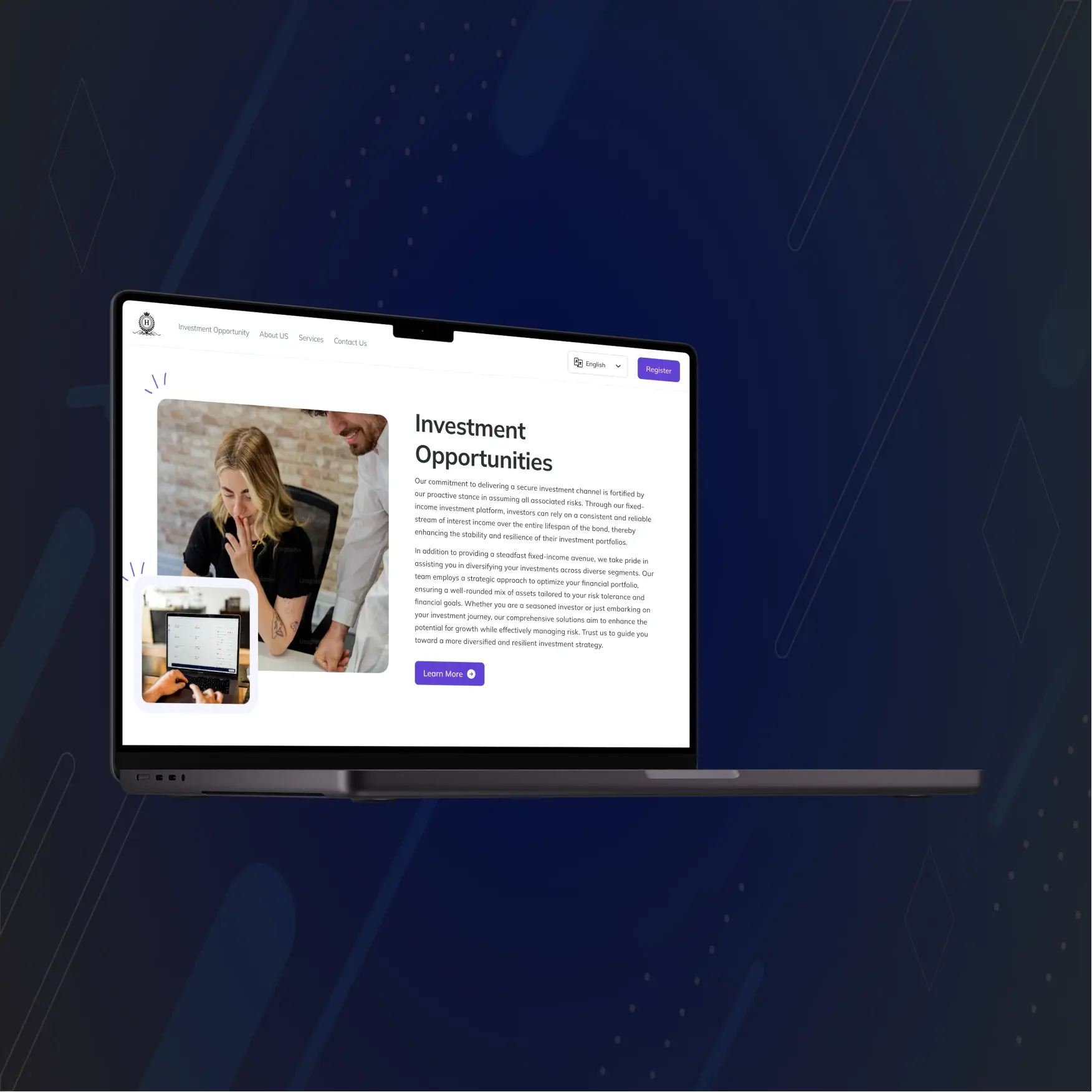
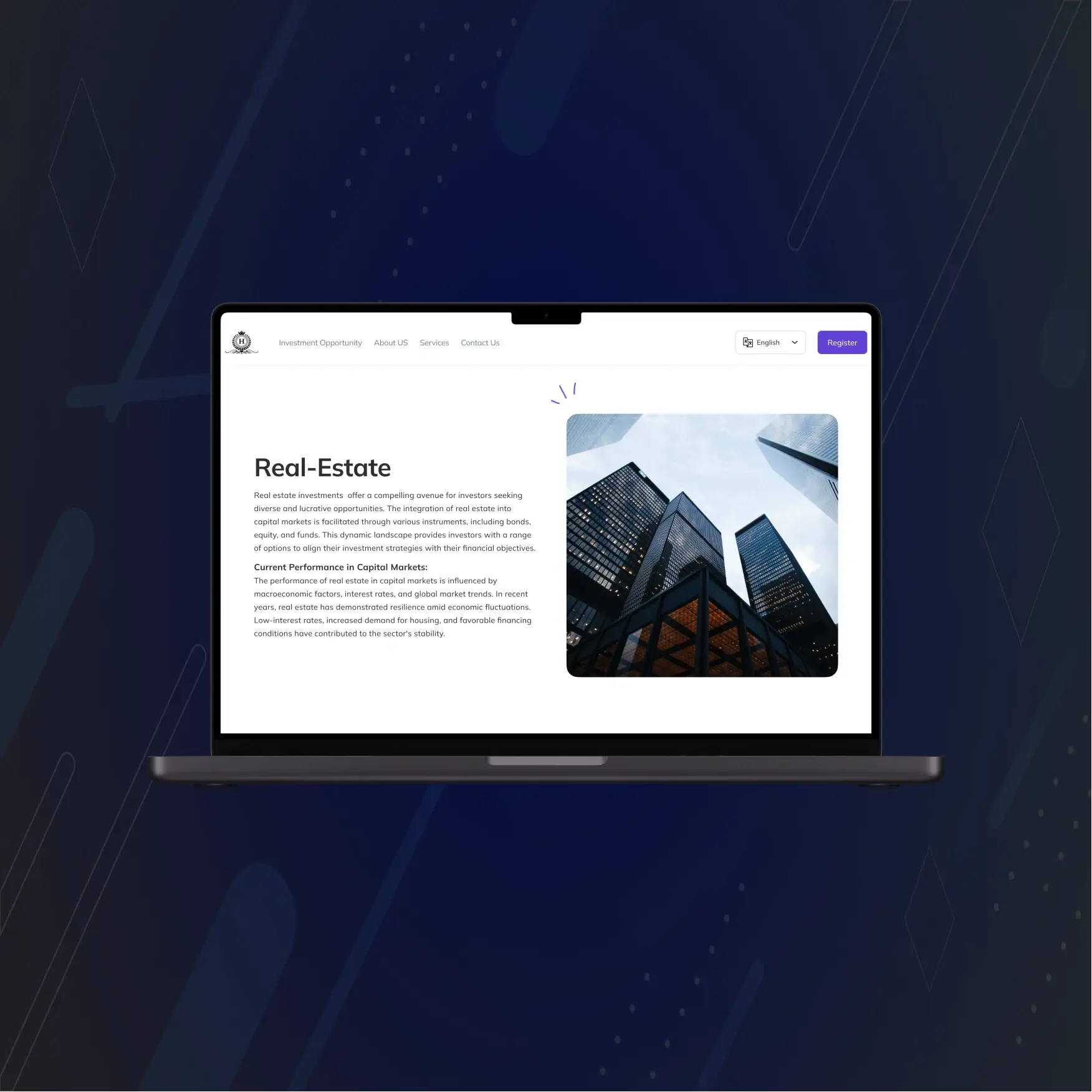
The UI design of HectorBond emphasizes simplicity and clarity, ensuring users can easily navigate the website. Key actions, such as scheduling meetings or submitting complaints, are prominently displayed to minimize the number of clicks required to access these features.
Consistent Design Language:
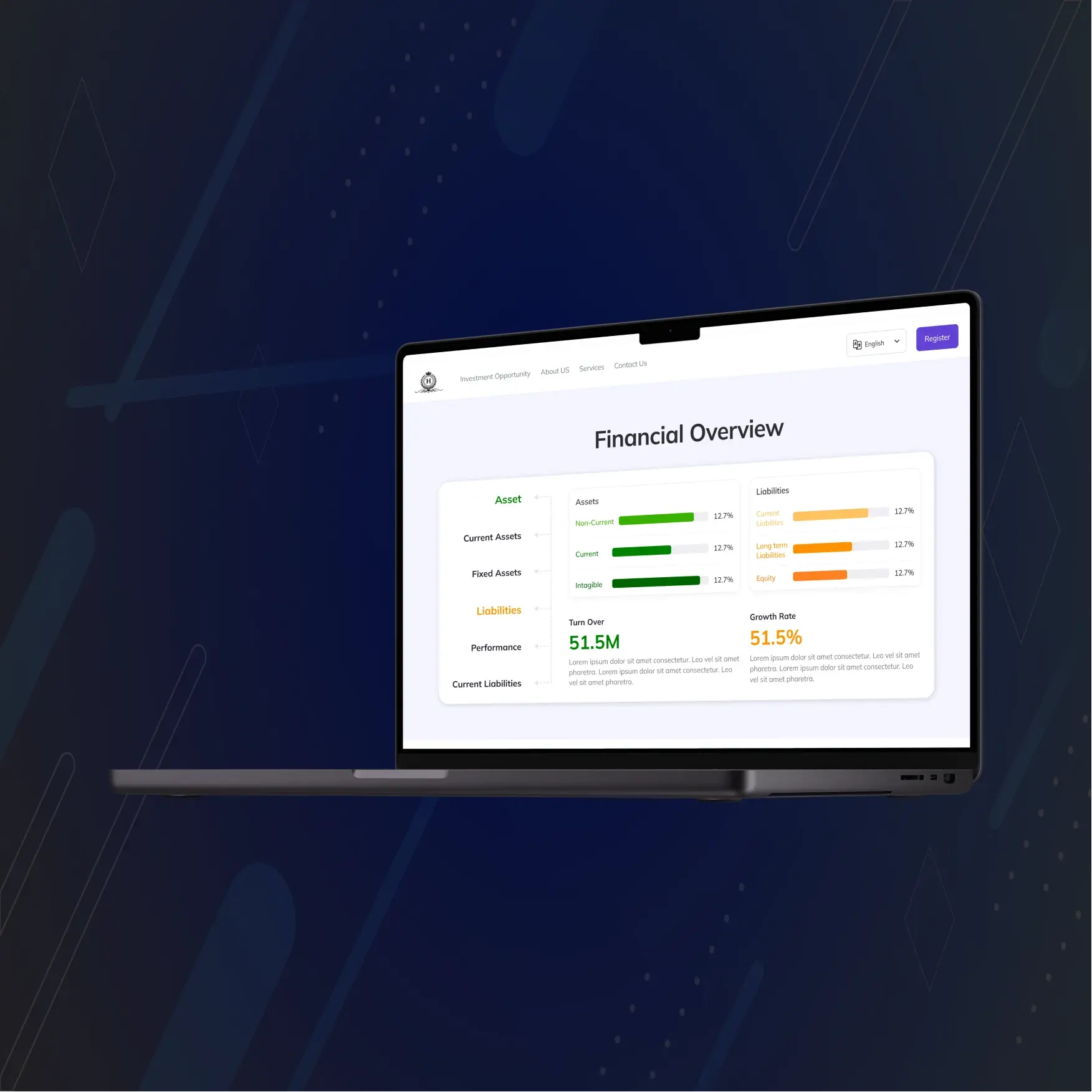
The platform maintains a consistent design language with a cohesive color scheme, typography, and iconography. This uniformity enhances user familiarity and comfort, providing a seamless user experience across different sections of the site.
Visual Hierarchy:
The design employs a clear visual hierarchy, using varying font sizes, weights, and colors to differentiate between primary and secondary actions. This helps users quickly identify and prioritize important tasks, improving overall usability.
User Experience (UX) Design
Intuitive Navigation:
HectorBond features an intuitive navigation system, including a navigation bar or menu that allows users to easily switch between different sections such as investor subscriptions, meeting scheduling, and complaint submission. Breadcrumbs and back buttons are included to help users keep track of their navigation history.
Responsive Design:
The website is designed to be responsive, ensuring that it adapts to various device screens, including smartphones, tablets, and desktops. This responsiveness ensures that users have a consistent and functional experience regardless of the device they use.
Interactive Elements:
HectorBond incorporates interactive elements such as the Investor Pool Carousel, which displays company logos and names in a carousel format, and Animated Count Values, which display incrementing statistics as users scroll to certain sections. These features add visual interest and engage users effectively.
User Feedback Mechanisms:
The platform includes feedback mechanisms allowing users to provide input on the relevance and helpfulness of notifications and other content. This continuous feedback loop helps improve the platform's content and delivery over time.
Seamless Integration:
Interactive features are seamlessly integrated with other functionalities, such as health assessments and consultation bookings. This cohesive integration ensures that users can smoothly transition between different tasks without any disruption.
Safety and Moderation:
Moderation and safety features are in place to ensure that user interactions, especially within community forums, are respectful and constructive. This promotes a positive and supportive user environment.
These design principles ensure that HectorBond provides a user-friendly, engaging, and efficient experience for all users.


